
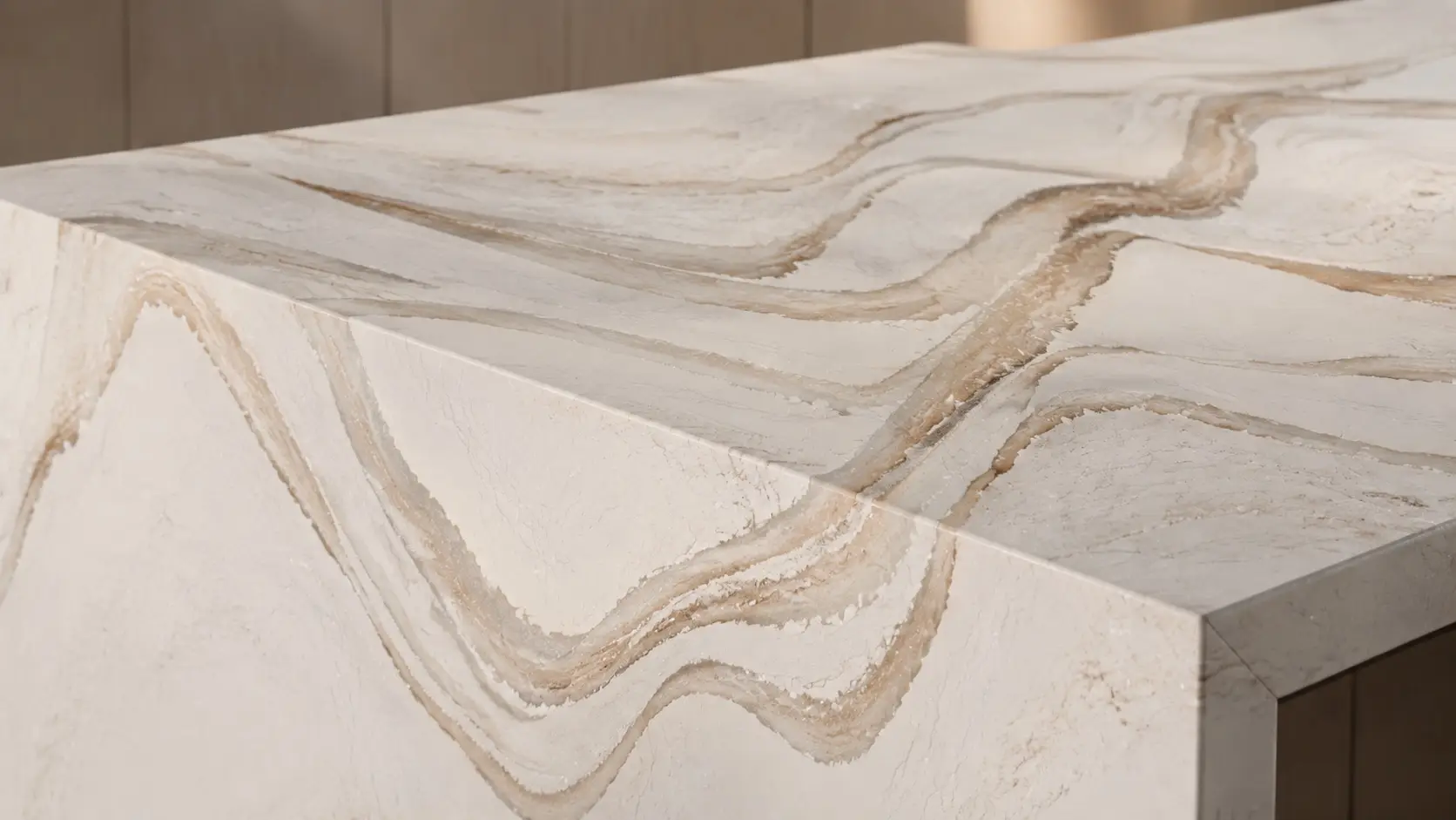
Cambria quartz colors are organized into nine families across the whole catalog, and that’s genuinely the fastest way to narrow down hundreds of designs into a shortlist.
This guide walks through those families, plus the finish and pattern choices that change how any given color actually reads, and calls out real colors Pacific Shore Stones carries in each. It covers the practical questions that actually decide a color: how it reads next to your cabinets, whether it’s a design that will still look right in ten years, and where each style fits best.
The Nine Color Families of Cambria Quartz
Cambria’s own catalog is filtered by nine families: White, Gray, Black, Beige, Gold, Brown, Blue, Green, and Red. Within each family, designs also break down by feature, mainly solid, veined, wavy, granular, or the Waterstone pattern group, which is what actually determines how busy or calm a slab reads from across the room.
White
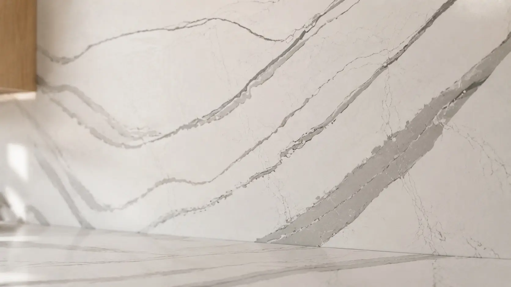
The largest and most requested family, and the one where marble-look designs live.
Pacific Shore Stones carries a range here, including the Brittanicca family (the classic marble-look Cambria design, along with its Warm, Gold Cool, and Gold Warm variants), Torquay, Inverness Frost, Whitehall, Harlow, and Ella. These range from a bright, near-solid white (Ella) to soft, wandering veins (Torquay, Inverness Frost) to bolder, more graphic veining (Harlow).
Gray
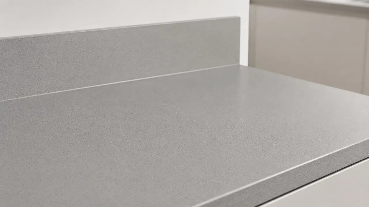
Solid or lightly textured grays work as a neutral that’s calmer than white and warmer than black. PSS carries Devon, Dunmore, and Fieldstone, ranging from a soft contemporary gray (Devon, Dunmore) to a deeper, near-charcoal solid (Fieldstone) that still reads gray rather than true black.
Black
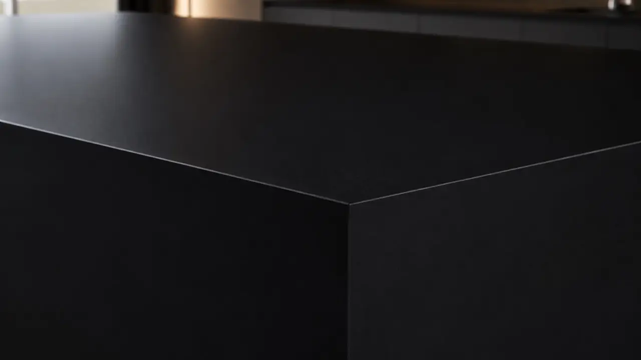
For a dramatic, grounding counter or island. PSS carries Blackpool, a flat, matte-leaning black that grounds a room without the heavy reflectivity of a glossy solid.
Beige and Brown
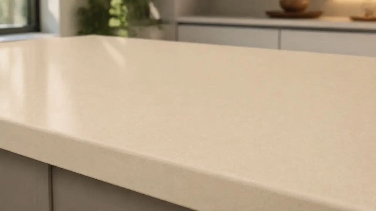
The warm-neutral, granite-look family, good for kitchens pairing with wood tones or aiming for a less stark palette than white or gray. PSS carries Windermere, Fairbourne, and Inverness Bronze, ranging from a warm, mottled tan (Windermere, Fairbourne) to bold copper-red veining (Inverness Bronze) that reads closer to natural granite than to marble.
Gold
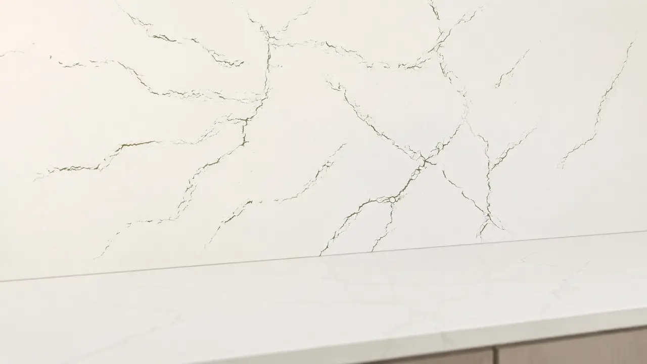
The warm-veined family, where the Brittanicca Gold designs live alongside options like Berkshire Brass, a quieter gold-veined design with a subtle, less saturated presence than the Brittanicca Gold variants.
Blue, Green, and Red
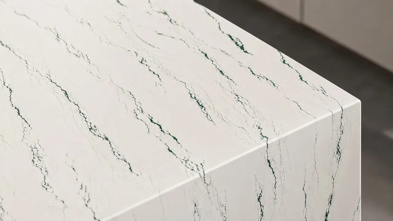
Cambria’s smaller, more specific families. PSS inventory includes Ivybridge, a green-veined design that reads as a quiet nod to color without committing to a bold blue, green, or red countertop.
Finish Changes the Color More Than People Expect
Cambria offers the same designs in up to four finishes: Polished, Cambria Satin, Cambria Matte, and the newer, far rarer Cambria Luxe.
-
Polished is the glossy, reflective standard most people picture.
-
Satin sits between polished and matte, a soft sheen that still shows some depth in the veining.
-
Matte is flat and non-reflective, which mutes the contrast in a busy veined design and tends to hide fingerprints, water spots, and light etching better than a glossy surface.
The same color in polished versus matte can read like two different countertops in a photo, so it’s worth seeing both before deciding, especially on a busier White or Gold design where the finish changes how loud the veining feels.
How to Actually Choose
The family narrows the field; these questions close it:
-
Marble-look or granite-look? If you want the visual language of natural marble (soft veining, a light background) without the upkeep, the White and Gold families cover it. If you want the mottled, speckled texture of natural granite, look at Beige and Brown.
-
Match your cabinets, or contrast them? A white counter on white cabinets reads monolithic and calm; a dark counter on light cabinets (or the reverse) creates a defined visual break. Neither is more correct, it depends on how much contrast the rest of the room already has.
-
Solid or veined? Solids (most of the Black and Gray family) hide seams more easily and read as calmer; veined and wavy designs (most of White and Gold) show more movement but need the seam placed thoughtfully so the pattern lines up.
-
Timeless or trend-forward? A soft white or warm neutral tends to stay comfortable the longest, since it’s the least tied to a specific design moment. Bolder blacks, blues, and reds read more current but are also the choices most associated with a particular era once trends shift.
What Doesn’t Change Between Colors
All Cambria quartz, regardless of color or family, shares the same core material properties: it’s engineered from natural quartz and resin, which makes it nonporous, stain-resistant, and free of the sealing that natural marble needs.
That’s true across every family and design in the catalog, so color choice is purely aesthetic; it doesn’t change how the counter performs day to day. The one honest caveat worth knowing before you fall in love with a busy veined design: like any engineered slab, Cambria isn’t a seamless product, so larger runs will show seams, and matte finishes will pick up surface markings from daily use that wash off but are part of living with the material.
See Cambria Colors in Person
Screen colors, lighting, and finish all change how a quartz slab reads, so the only reliable way to choose is against a full slab in your own kitchen light.
Pacific Shore Stones carries Cambria quartz across showrooms in Texas, Oklahoma, Arkansas, and Mississippi. Browse the Cambria brand page, check live inventory, or go deeper on the marble-look family in our guide to Cambria Brittanicca.