Why This Decision Matters
The backsplash occupies prime visual real estate. It sits at eye level, directly in your sightline every time you cook, clean, or pour your morning coffee. Color psychology plays a real role here. Warm tones—yellows, oranges, terracotta—stimulate appetite and create gathering energy. Cool tones—blues, greens, grays—promote calm and cleanliness. Neutrals—whites, creams, beiges—provide flexibility and broad appeal. Beyond mood, your backsplash color affects practical concerns. Some colors hide splatters and water spots. Others show every fingerprint. Some photograph beautifully but feel oppressive in person. Others seem boring in samples but come alive on the wall. Understanding these dynamics helps you move beyond “what looks pretty” toward “what actually works.”The Colors Dominating Kitchens
Backsplash trends have shifted dramatically. White subway tile still exists, but it’s no longer the default. Homeowners want personality.-
Warm Whites and Creams have replaced stark, clinical whites. These softer tones feel inviting rather than sterile. They work with virtually any countertop and cabinet combination, making them ideal for resale-conscious homeowners or anyone seeking timeless flexibility.
-
Sophisticated Grays function as the new neutral. Gray backsplashes pair elegantly with both light and dark cabinetry, offering contemporary sophistication without bold commitment. Taupe—that warm gray-brown hybrid—adds depth while remaining endlessly versatile.
-
Jewel Tones are having a major moment. Emerald green, sapphire blue, deep burgundy—these rich, saturated colors add luxury and personality that neutrals simply can’t deliver. Paired with light countertops (white marble, pale quartz), jewel tones create stunning contrast. Paired with warm wood, they feel grounded and sophisticated.
-
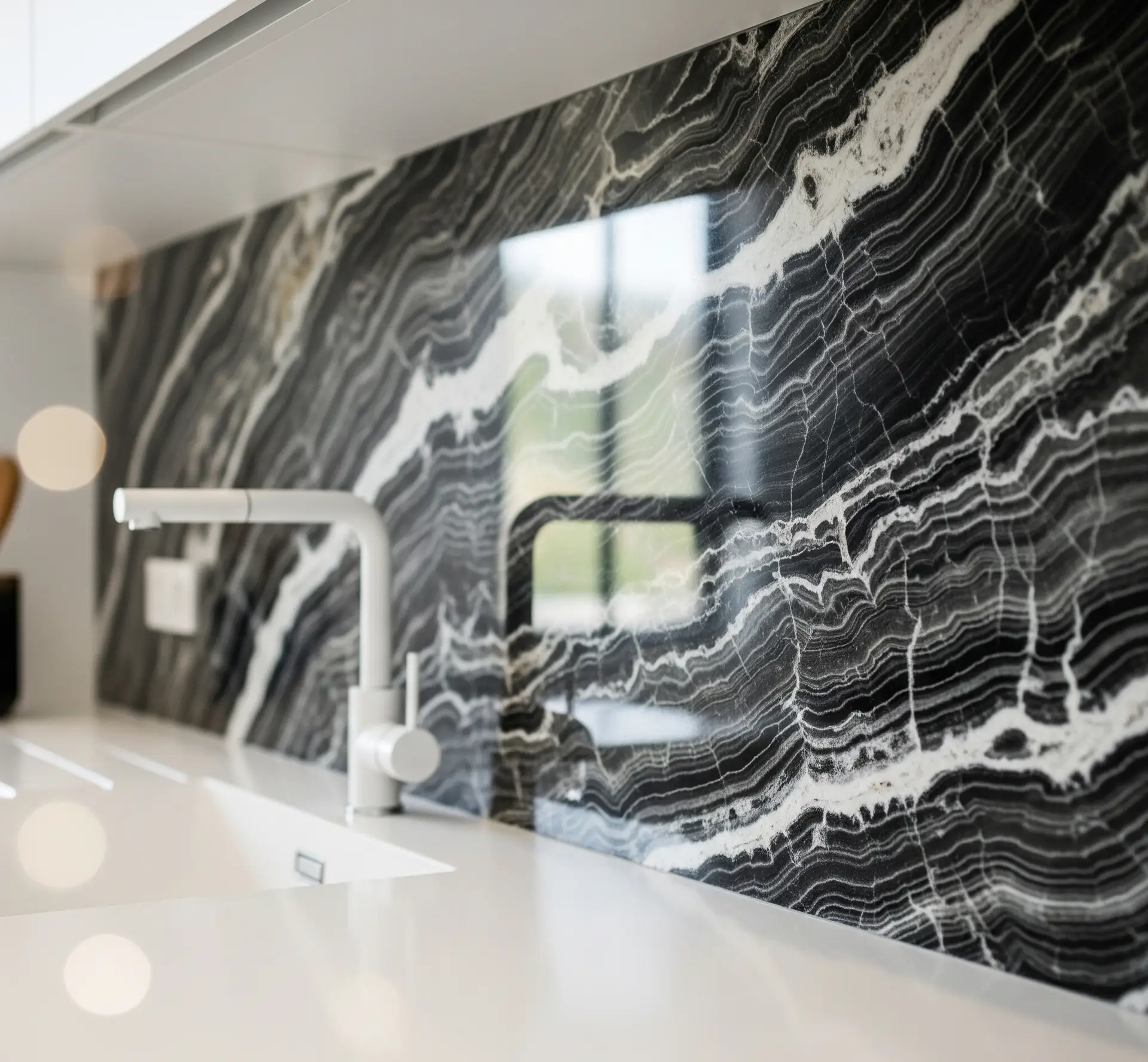
Moody Darks create intimate, dramatic spaces. Deep greens, charcoal, navy—these colors work beautifully in well-lit kitchens where they add depth without feeling oppressive. In poorly lit spaces, they can backfire. Lighting assessment is essential before committing to the dark side.
-
Earthy Naturals appeal to homeowners embracing organic design. Terracotta, warm beiges, soft ochres—these tones connect kitchens to nature and age gracefully over time. They pair naturally with wood cabinets and stone countertops, creating spaces that feel honest rather than designed.
Matching Backsplash Color to Your Kitchen Style
Your design aesthetic should guide color selection. Different styles call for different palettes. Modern kitchens thrive with clean, bold choices. White, gray, black, or saturated jewel tones in geometric patterns create visual interest without clutter. Glossy finishes reflect light and enhance the contemporary feel. Farmhouse and rustic kitchens benefit from warmth. Cream, soft gray, warm white, or terracotta complement exposed wood and vintage-inspired details. Handmade tiles with natural variation—zellige, for instance—add authentic charm these styles demand. Transitional kitchens blend traditional and contemporary elements, calling for balanced colors. Soft grays, warm whites, or subtle accent colors work beautifully. The goal is sophistication without committing fully to either traditional or modern extremes. Minimalist kitchens demand restraint. Monochromatic schemes, large-format tiles with minimal grout lines, and clean finishes create the uncluttered calm these spaces require. If you add color, make it singular and intentional.Coordinating with Your Countertops
One question surfaces constantly: should the backsplash match the countertops? The answer is almost always no—at least not exactly. Matching creates flatness. Coordinating creates depth. With black countertops, lighter backsplash colors (white, cream, soft gray) create striking contrast and prevent the space from feeling like a cave. Alternatively, jewel tones can echo the drama while adding warmth and personality. If you’re considering dark surfaces, our guide to black kitchen countertops covers pairing strategies in depth. With white or light countertops, nearly anything works. Light surfaces function as neutral canvases, letting your backsplash color take center stage. This is your opportunity to be bold if boldness appeals to you. With gray cabinets, avoid matching the exact shade—that creates monotony. Instead, choose a backsplash in a contrasting value (lighter or darker gray) or introduce a complementary color entirely. Warm metals in hardware can bridge cool backsplash and cabinet tones beautifully.The Resale Question
If you’re planning to sell your home eventually, backsplash color affects buyer perception. Neutral colors—whites, creams, soft grays, beiges—appeal to the broadest audience. They support higher resale values because they don’t require buyers to imagine past someone else’s taste. Bold colors can be polarizing. What you love, the next owner might not. If resale matters significantly, neutral choices are safer investments. However, a well-executed bold backsplash in quality materials demonstrates design sophistication. It can be an asset rather than a liability—especially in markets where buyers appreciate distinctive homes. The honest advice: if this is your forever home, choose what you love. If you’re selling within five years, lean neutral.How to Actually Choose
Follow this process to land on a backsplash color you’ll love.-
Start with your countertops and cabinets. These are your largest visual elements. Your backsplash needs to complement them, not compete. Gather samples of both and evaluate potential backsplash colors alongside them—never in isolation.
-
Assess your lighting honestly. Walk through your kitchen at different times of day. Note where natural light falls and where shadows gather. Colors behave dramatically differently under varying light conditions. That perfect sample might look completely different installed on your wall.
-
Consider your lifestyle. How often do you cook? How much do you clean? How long do you plan to stay? Honest answers guide practical choices.
-
Get large samples. Never commit based on a two-inch swatch. Order the biggest samples available and live with them for at least a week. Tape them to your actual wall. Look at them while cooking, while cleaning, while half-awake in the morning.
-
Trust your gut—eventually. Research and strategy matter, but at some point, you have to decide. The backsplash that keeps drawing your eye is probably the right one.